Wiredbloodtest.jpg

Projects

Better information and design can help make complicated things a little more clear.
Here are some companies & products I’ve been part of.

Building H

Building H

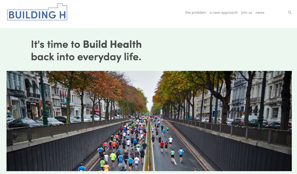
Building H is a small effort to get people to think bigger.

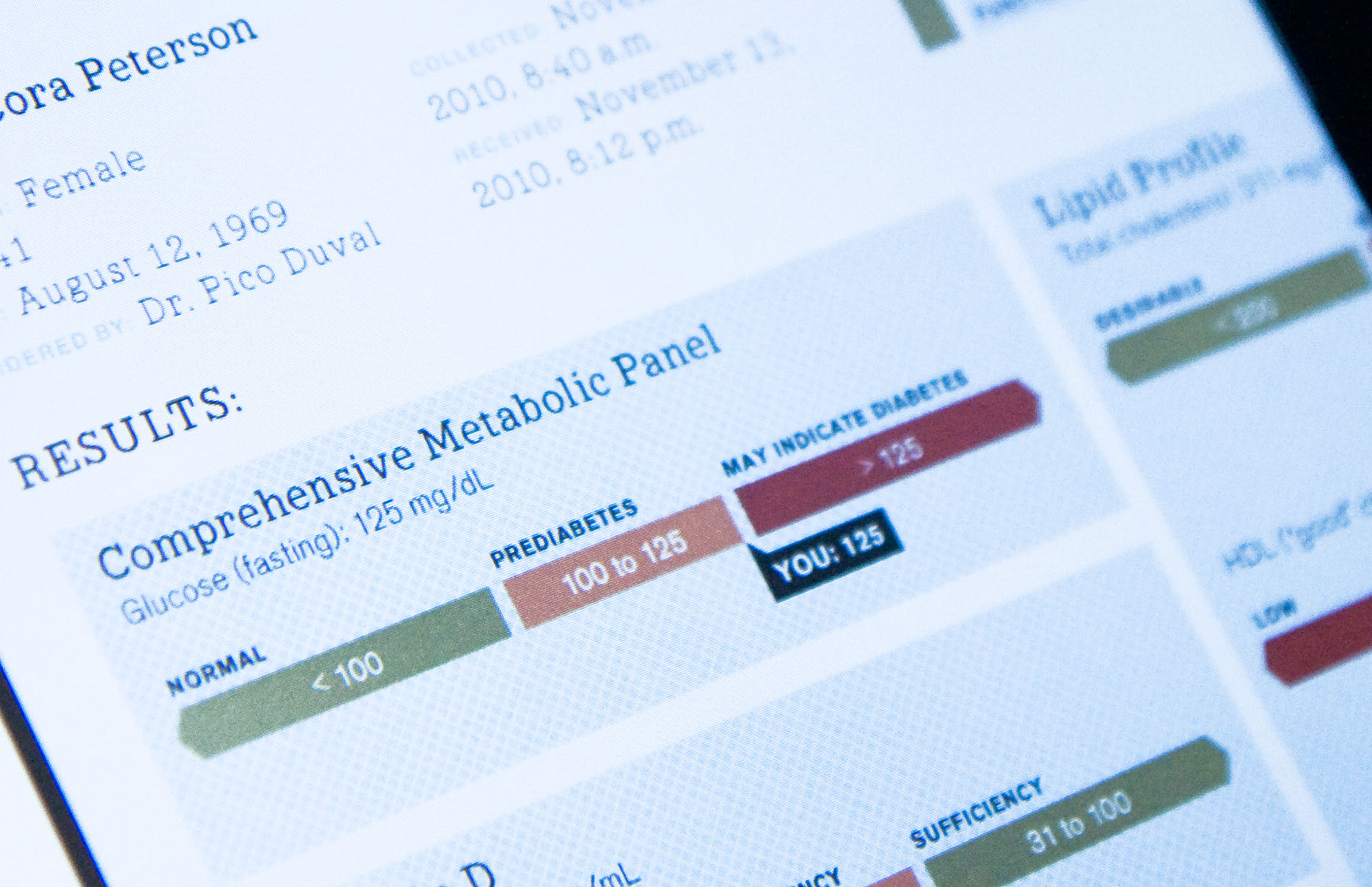
The idea is simple: Modern life is good at making us happy, but not at making us healthy. Cheap calories, free parking, 2nd refrigerators: it’s created an epidemic of disease from diabetes to cancer. It’s time to re-engineer how civilization meets basic human needs - food, shelter, community, transportation - so where we live & what we eat makes us healthy by design. Huge opportunities await innovators willing to go beyond wearables or coaching apps. Let’s stop fighting modern life and start rebuilding it.

So what, exactly is Building H? Right now it’s an idea that I’m talking about. It’s also a newsletter. And a series of blog posts that carve out how specific companies, organizations, and entrepreneurs are rebuilding health, right now.

Iodine

Iodine

I co-founded Iodine in 2013, with Matt Mohebbi (creator of Google Flu Trends, among other accomplishments).

Iodine is a website that makes medication information more clear and relevant to real people. The site has gathered reports from more than 100,000 real people across more than 3,000 medications, and includes data from the FDA, NIH and other sources. In 2018, it won the Webby Award for Best Health website.

In 2016, Iodine was acquired by GoodRx, an outstanding company that helps people find more affordable medications.

openFDA

openFDA

In 2013, the FDA’s chief health information officer came to Iodine with an idea: could we help develop a new resource for making FDA data on drugs, devices, and food more accessible and useful?

The result was a collaboration that created openFDA, now one of the most widely used and useful open data resources in the US federal government.

The success of openFDA is due to the fact that we not only created APIs to access the data - we also built thorough documentation on how best to use the data, and developed a community of users to help each other navigate the data. We ran openFDA until 2016; it’s now managed by another Beltway contractor.

Flip the Clinic

Flip the Clinic

The notion behind Flip the Clinic was to turn the traditional doctor/patient relationship on its head. We wanted to inspire new innovations that not only empowered patients in their care, but also gave providers (not just doctors, but nurses and office staff too) more permission to innovate.

Flip the Clinic turned into a few things: First a website that serves as a hub for ideas and innovations for clinics to try out. Second, a community of innovators who we met with nationwide in a series of small workshops.

Though funding for Flip the Clinic has ceased, there remain dozens of medical clinics and offices nationwide that have internalized the ideas and practices, to help deliver better care to their patients.

One Plus One Labs

One Plus One Labs

Of all the things we’re given in medicine, few provoke more despair and confusion than the lab test report. So why not put information design and behavior change to work to make it better? That was my inspiration in creating an award-winning template in the pages of WIRED. And that template provoked a tremendous response, from designers as well as from across the healthcare industry.

That set me off to create One Plus One Labs with Adam Brodsley, a gifted designer at Volume. Though the company never took off, it connected us with a host of people who recognized the same need: to develop tools and resources that make it easier for people to navigate their own health status and health options.

Visualizing Health

Visualizing Health

Visualizing Health grew out of my tenure at the Robert Wood Johnson Foundation. Joining forces with the amazing Vic Strecher at the University of Michigan, we wanted to run a new sort of experiment: Could we help people understand their health status by developing better visualizations of personal health information?

With the guidance of the amazing Tim Leong, we assigned some amazing graphic designers the same data, and asked them to display it in a compelling way. We then tested these different visualizations in a survey with real people, to see which presentations were most effective and best understood.